Remote Group Session
UX Case Study
Context
Spotify is a leading digital music streaming platform, continually enhancing its service to make the user experience more intuitive and engaging. With frequent updates and regular testing of new features, the platform remains dynamic and innovative. I've been a Spotify user since its launch in the UAE in 2018, and it has been my go-to music app ever since. I'm always excited to explore their latest features, which is how I discovered the "Remote Group Session" feature.
During the height of the pandemic, while adhering to social distancing measures, this feature helped me feel connected to friends and family. It provided a sense of closeness during a time of isolation. However, I was surprised to learn that many people I spoke with were unaware of this feature, despite how impactful it was for me.
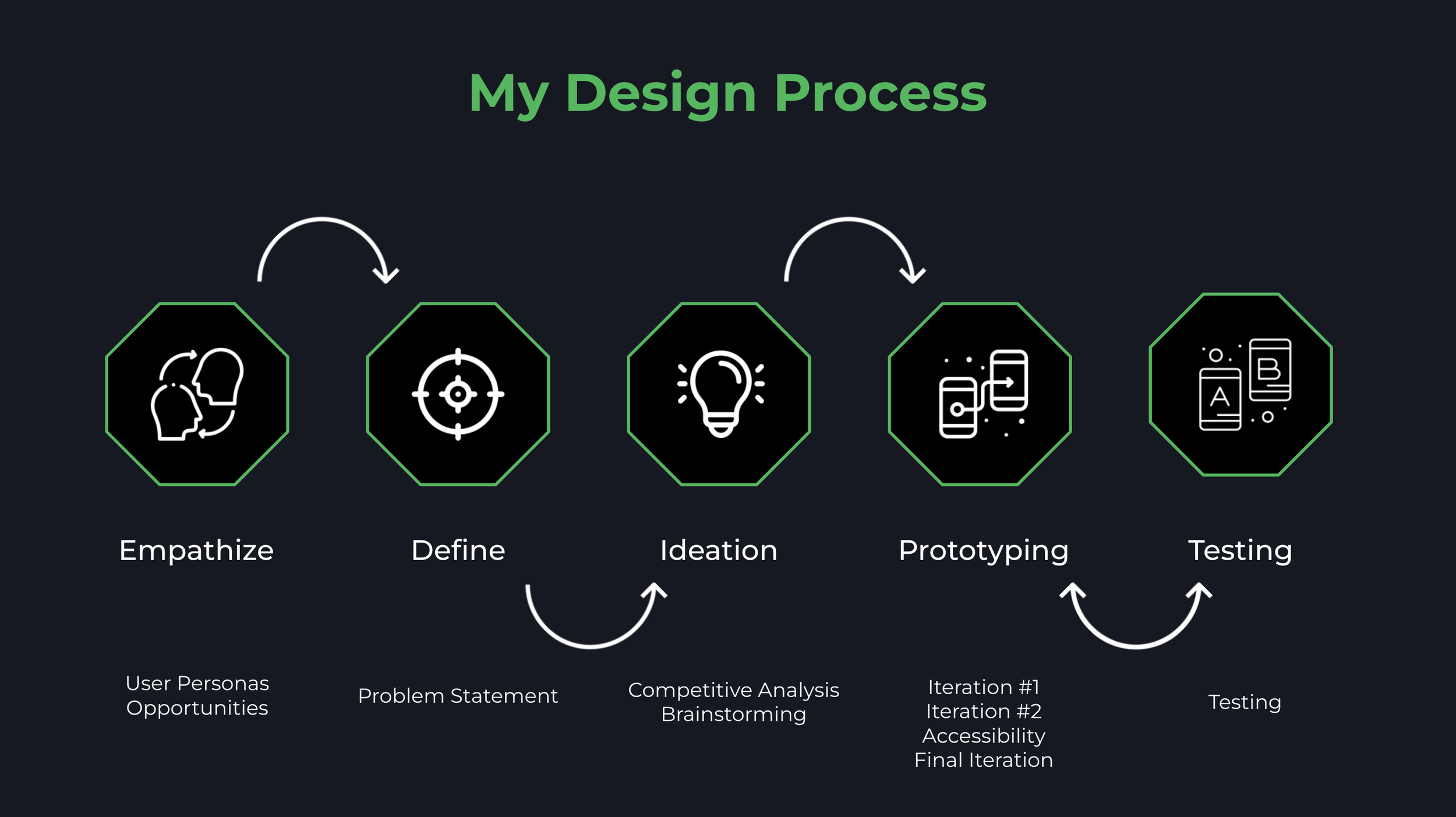
Empathize
During the initial phase, I conducted user interviews and task analyses to better understand users' goals, needs, and pain points while interacting with Spotify. These interviews informed the creation of user journey maps, which synthesized insights from both the interviews and task analyses. Below is one of the five user journey maps generated from this process.

After conducting user interviews and identifying pain points, I synthesized the information into three logical categories. These categories formed the basis for the three personas I created:
Super User: An avid Spotify user familiar with and utilizing all the platform's features. This user tends to provide technical feedback on the Spotify experience due to their extensive interaction with the service. Typically, this persona is an audiophile or strongly interested in music, audiobooks, or podcasts.
Average User: A casual Spotify user who may not be aware of all the platform's features. This user primarily uses Spotify to listen to saved music and does not expect extensive functionality, as their engagement is limited to personal listening.
New User: A first-time or very recent Spotify user. This persona is new to the platform and provides fresh perspectives on the initial user experience. While they may evolve into an Average or Super User over time, their current feedback is based on their initial interactions with Spotify.

After creating the personas and listing the pain points for each user type, I prioritized features into "Must Haves," "Should Haves," "Could Haves," and "Won't Haves." This prioritization was based on the frequency of pain points across personas and their impact on the overall Spotify experience.
Must Haves:
Make Features Easier to Find: Improve the discoverability of key features.
Highlight Social Listening Features: Increase visibility and accessibility of social listening functionalities.
Lyric Section Redesign: Adjust color contrast to enhance readability.
Should Haves:
Homepage Redesign: Reduce clutter for a more streamlined interface.
Toggle for Music Animation ON/OFF: Allow users to control music animation.
Redesign Music Player: Make menus more intuitive for a better user experience.
Could Haves:
Customize Homepage: Allow users to tailor the homepage to their preferences.
Shortcuts for Quick Access: Add shortcuts for frequently used features or tabs.
Translation for Foreign Language Lyrics: Offer translations for lyrics in foreign languages.
Remake Icons: Update icons for better clarity and understanding.
Won't Haves:
No Change to Green/Black UI Palette: Retain the existing color scheme.
No Redesign of Onboarding Experience: Maintain the current onboarding process

Define

Competitive Analysis
Spotify's competitors:
Apple Music
Youtube Music
Amazon Music Free/Unlimited
SoundCloud


Ideation
After defining the problem statement and conducting the competitor analysis, I was in a good position to start ideating solutions to the opportunities I had identified previously.
I started this phase of the project by quickly sketching out a few ideas.

I proceeded to build quick low-fidelity prototypes based on these sketches.
The first iteration of the low-fidelity prototypes explored two potential placements for the "Remote Group Session" feature. The aim was to determine which location would be more visible and intuitive for users searching for or discovering social features. In this iteration, the feature was made accessible through:
The "Share Menu" is positioned next to the song name.
The "Devices Menu" is located above the lyrics section in the Music Player.
This approach allowed us to evaluate the effectiveness of each placement in enhancing user visibility and intuitiveness for accessing social features.

Testing
A/B testing was conducted to determine which of the two locations—"Share Menu" or "Devices Menu"—was more intuitive for the majority of testers. The results indicated that most testers found the feature in the "Share Menu" to be more intuitive than the "Devices Menu."
However, a key observation during the testing phase was that many users instinctively tapped the three dots on the top right corner of the screen, known as the "More Menu." Based on this insight, the next iteration of the low-fidelity prototypes included incorporating the feature into the "More Menu" to align with users' natural interactions.

Final High-Fidelity Prototype
